# import librariesimport pandas as pdfrom statsforecast import StatsForecastfrom statsforecast.models import AutoARIMAimport matplotlib.pyplot as plt
c:\Users\mftok\OneDrive\Github\mftokic.github.io\.venv\lib\site-packages\tqdm\auto.py:21: TqdmWarning: IProgress not found. Please update jupyter and ipywidgets. See https://ipywidgets.readthedocs.io/en/stable/user_install.html
  from .autonotebook import tqdm as notebook_tqdm
# read datadata_raw = pd.read_csv("../posts/2024-10-02-ts-fundamentals-whats-a-time-series/example_ts_data.csv")data_raw = (# select columns data_raw[["Country", "Product", "Date", "Revenue"]]# change data types .assign( Date = pd.to_datetime(data_raw["Date"]), Revenue = pd.to_numeric(data_raw["Revenue"]) ))# print the first few rowsprint(data_raw.head())
         Country    Product       Date  Revenue
0  United States  Ice Cream 2019-01-01       10
1  United States  Ice Cream 2019-02-01       12
2  United States  Ice Cream 2019-03-01       15
3  United States  Ice Cream 2019-04-01        9
4  United States  Ice Cream 2019-05-01       11
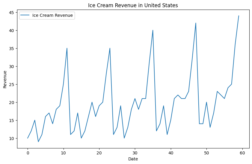
# filter on specific seriesus_ic_raw = data_raw[(data_raw["Country"] =="United States") & (data_raw["Product"] =="Ice Cream")]# create unique idus_ic_raw["unique_id"] = us_ic_raw["Country"] +"_"+ us_ic_raw["Product"]# convert date to datetimeus_ic_raw["Date"] = pd.to_datetime(us_ic_raw["Date"])# plot the dataplt.figure(figsize=(10, 6))plt.plot(us_ic_raw.index, us_ic_raw["Revenue"], label="Ice Cream Revenue")plt.xlabel("Date")plt.ylabel("Revenue")plt.title("Ice Cream Revenue in United States")plt.legend()
C:\Users\mftok\AppData\Local\Temp\ipykernel_2820\2972639449.py:5: SettingWithCopyWarning:
A value is trying to be set on a copy of a slice from a DataFrame.
Try using .loc[row_indexer,col_indexer] = value instead

See the caveats in the documentation: https://pandas.pydata.org/pandas-docs/stable/user_guide/indexing.html#returning-a-view-versus-a-copy
  us_ic_raw["unique_id"] = us_ic_raw["Country"] + "_" + us_ic_raw["Product"]
C:\Users\mftok\AppData\Local\Temp\ipykernel_2820\2972639449.py:8: SettingWithCopyWarning:
A value is trying to be set on a copy of a slice from a DataFrame.
Try using .loc[row_indexer,col_indexer] = value instead

See the caveats in the documentation: https://pandas.pydata.org/pandas-docs/stable/user_guide/indexing.html#returning-a-view-versus-a-copy
  us_ic_raw["Date"] = pd.to_datetime(us_ic_raw["Date"])
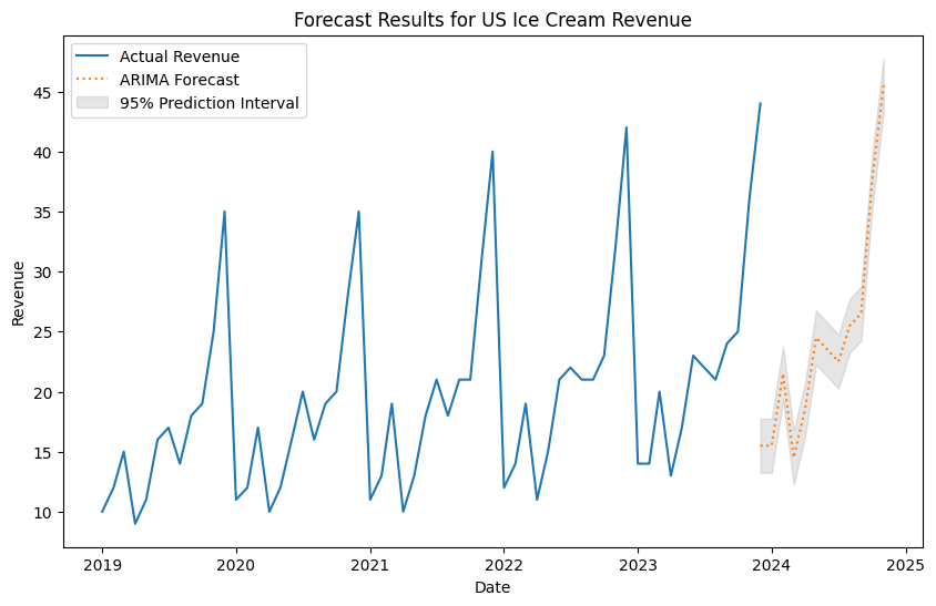
# get final data for forecastingus_ic_clean = us_ic_raw[["unique_id", "Date", "Revenue"]].copy()# set up models to trainsf = StatsForecast( models=[AutoARIMA(season_length=12)], freq='ME',)# fit the model and forecast for 12 months aheadY_hat_df = sf.forecast(df = us_ic_clean, time_col ="Date", target_col ="Revenue", id_col ="unique_id", h=12, level=[95], fitted=True)print(Y_hat_df.head())# convert date to be first of the monthY_hat_df["Date"] = Y_hat_df["Date"].dt.to_period("M").dt.to_timestamp()
                 unique_id       Date  AutoARIMA  AutoARIMA-lo-95  \
0  United States_Ice Cream 2023-12-31       15.5        13.248834
1  United States_Ice Cream 2024-01-31       15.5        13.248834
2  United States_Ice Cream 2024-02-29       21.5        19.248835
3  United States_Ice Cream 2024-03-31       14.5        12.248834
4  United States_Ice Cream 2024-04-30       18.5        16.248835

   AutoARIMA-hi-95
0        17.751165
1        17.751165
2        23.751165
3        16.751165
4        20.751165
# concat both df togetherfuture_fcst_df = pd.concat([us_ic_clean, Y_hat_df], axis=0)# make date the indexfuture_fcst_df.set_index("Date", inplace=True)print(future_fcst_df.tail())
                          unique_id  Revenue  AutoARIMA  AutoARIMA-lo-95  \
Date
2024-07-01  United States_Ice Cream      NaN       22.5        20.248835
2024-08-01  United States_Ice Cream      NaN       25.5        23.248835
2024-09-01  United States_Ice Cream      NaN       26.5        24.248835
2024-10-01  United States_Ice Cream      NaN       37.5        35.248833
2024-11-01  United States_Ice Cream      NaN       45.5        43.248833

            AutoARIMA-hi-95
Date
2024-07-01        24.751165
2024-08-01        27.751165
2024-09-01        28.751165
2024-10-01        39.751167
2024-11-01        47.751167
# plot the future fcst dataplt.figure(figsize=(10, 6))# plot the original revenue data as line and forecast as dotted lineplt.plot(future_fcst_df.index, future_fcst_df["Revenue"], label="Actual Revenue")plt.plot(future_fcst_df.index, future_fcst_df["AutoARIMA"], label="ARIMA Forecast", linestyle='dotted')# plot the prediction intervals as shaded areasplt.fill_between(future_fcst_df.index, future_fcst_df["AutoARIMA-lo-95"], future_fcst_df["AutoARIMA-hi-95"], color='gray', alpha=0.2, label='95% Prediction Interval')# chart formattingplt.xlabel("Date")plt.ylabel("Revenue")plt.title("Forecast Results for US Ice Cream Revenue")plt.legend()# save the plot# plt.savefig("chart1", dpi = 300, bbox_inches = "tight")
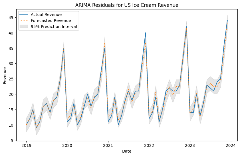
# get fitted values of the historical data# Note: The fitted values are the predicted values for the training dataresidual_values = sf.forecast_fitted_values()# make date the indexresidual_values.set_index("Date", inplace=True)print(residual_values.head())
                          unique_id  Revenue  AutoARIMA  AutoARIMA-lo-95  \
Date
2019-01-01  United States_Ice Cream     10.0   9.990125         7.738959
2019-02-01  United States_Ice Cream     12.0  11.988250         9.737084
2019-03-01  United States_Ice Cream     15.0  14.985375        12.734209
2019-04-01  United States_Ice Cream      9.0   8.991500         6.740334
2019-05-01  United States_Ice Cream     11.0  10.989625         8.738459

            AutoARIMA-hi-95
Date
2019-01-01        12.241291
2019-02-01        14.239416
2019-03-01        17.236542
2019-04-01        11.242666
2019-05-01        13.240791
# plot the historical fitted valuesplt.figure(figsize=(10, 6))# plot the original revenue data as line and forecast as dotted lineplt.plot(residual_values.index, residual_values["Revenue"], label="Actual Revenue")plt.plot(residual_values.index, residual_values["AutoARIMA"], label="Forecasted Revenue", linestyle='dotted')# plot the prediction intervals as shaded areasplt.fill_between(residual_values.index, residual_values["AutoARIMA-lo-95"], residual_values["AutoARIMA-hi-95"], color='gray', alpha=0.2, label='95% Prediction Interval')# chart formattingplt.xlabel("Date")plt.ylabel("Revenue")plt.title("ARIMA Residuals for US Ice Cream Revenue")plt.legend()# save the plot# plt.savefig("chart2", dpi = 300, bbox_inches = "tight")
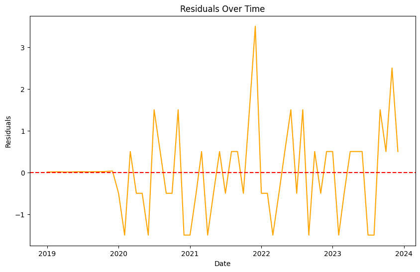
# calculate residuals and plot the residuals directly as a line chart residuals = residual_values["Revenue"] - residual_values["AutoARIMA"]plt.figure(figsize=(10, 6))plt.plot(residuals.index, residuals, label="Residuals", color='orange')plt.axhline(y=0, color='red', linestyle='--')plt.xlabel("Date")plt.ylabel("Residuals")plt.title("Residuals Over Time")# save the plot# plt.savefig("chart3", dpi = 300, bbox_inches = "tight")
Text(0.5, 1.0, 'Residuals Over Time')
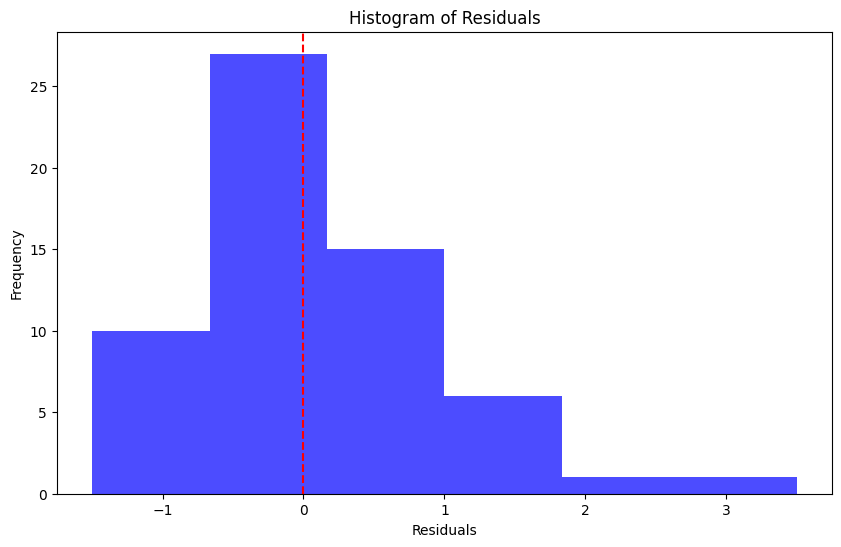
# create histogram of residualsplt.figure(figsize=(10, 6))plt.hist(residuals, bins=6, color='blue', alpha=0.7)plt.axvline(x=0, color='red', linestyle='--')plt.xlabel("Residuals")plt.ylabel("Frequency")plt.title("Histogram of Residuals")# save the plot# plt.savefig("chart4", dpi = 300, bbox_inches = "tight")
Text(0.5, 1.0, 'Histogram of Residuals')
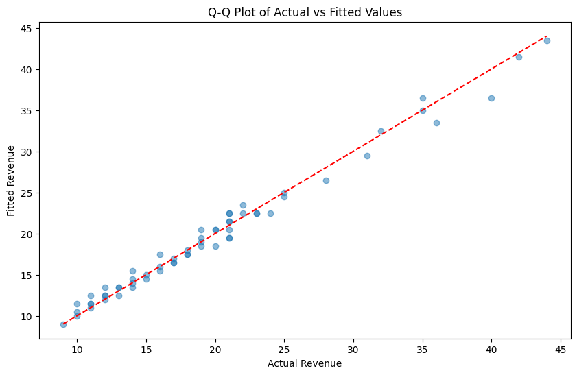
# create chart that puts the actual values on one side and the fitted values on the other as a scatter plotplt.figure(figsize=(10, 6))# plot the actual valuesplt.scatter(residual_values["Revenue"], residual_values["AutoARIMA"], label="Fitted Values", alpha=0.5)# plot the 45 degree lineplt.plot([residual_values["Revenue"].min(), residual_values["Revenue"].max()], [residual_values["Revenue"].min(), residual_values["Revenue"].max()], color='red', linestyle='--', label="45 Degree Line")# chart formattingplt.xlabel("Actual Revenue")plt.ylabel("Fitted Revenue")plt.title("Q-Q Plot of Actual vs Fitted Values")# save the plot# plt.savefig("chart5", dpi = 300, bbox_inches = "tight")
Text(0.5, 1.0, 'Q-Q Plot of Actual vs Fitted Values')
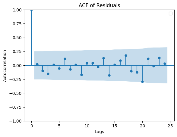
# create ACF plot on the residualsfrom statsmodels.graphics.tsaplots import plot_acfplt.figure(figsize=(10, 6))plot_acf(residuals, lags=24)plt.title("ACF of Residuals")plt.xlabel("Lags")plt.ylabel("Autocorrelation")plt.legend()# save the plot# plt.savefig("chart6", dpi = 300, bbox_inches = "tight")
C:\Users\mftok\AppData\Local\Temp\ipykernel_2820\3336845809.py:8: UserWarning: No artists with labels found to put in legend.  Note that artists whose label start with an underscore are ignored when legend() is called with no argument.
  plt.legend()
<Figure size 1000x600 with 0 Axes>
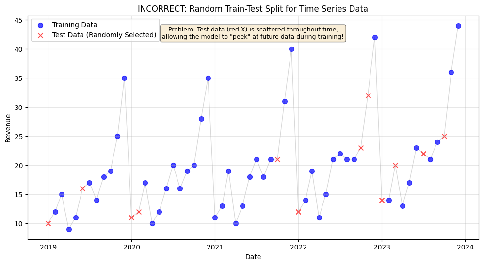
# create a chart that shows incorrect train test split by including future data in the training setimport numpy as np# set random seed for reproducibilitynp.random.seed(42)# create a copy of the residual values dataincorrect_split_df = residual_values.copy().reset_index()# randomly select 20% of the data as test set (INCORRECT for time series!)test_size =int(len(incorrect_split_df) *0.2)test_indices = np.random.choice(incorrect_split_df.index, size=test_size, replace=False)# create train/test labelsincorrect_split_df['split'] ='Train'incorrect_split_df.loc[test_indices, 'split'] ='Test'# plot the incorrect splitplt.figure(figsize=(12, 6))# plot train datatrain_data = incorrect_split_df[incorrect_split_df['split'] =='Train']plt.scatter(train_data['Date'], train_data['Revenue'], color='blue', label='Training Data', alpha=0.7, s=50)# plot test datatest_data = incorrect_split_df[incorrect_split_df['split'] =='Test']plt.scatter(test_data['Date'], test_data['Revenue'], color='red', label='Test Data (Randomly Selected)', alpha=0.7, s=50, marker='x')# connect all points with a line to show the time seriesplt.plot(incorrect_split_df['Date'], incorrect_split_df['Revenue'], color='gray', alpha=0.3, linewidth=1, zorder=0)# chart formattingplt.xlabel("Date")plt.ylabel("Revenue")plt.title("INCORRECT: Random Train-Test Split for Time Series Data")plt.legend()plt.grid(True, alpha=0.3)# add annotation explaining the problemplt.text(0.5, 0.95, 'Problem: Test data (red X) is scattered throughout time,\nallowing the model to "peek" at future data during training!', transform=plt.gca().transAxes, bbox=dict(boxstyle='round', facecolor='wheat', alpha=0.5), verticalalignment='top', horizontalalignment='center', fontsize=9)# save the plot# plt.savefig("chart7.png", dpi = 300, bbox_inches = "tight")
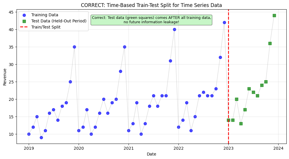
# now create a chart showing the CORRECT time-based splitcorrect_split_df = residual_values.copy().reset_index()# split by time: last 20% for testing (CORRECT for time series!)split_point =int(len(correct_split_df) *0.8)correct_split_df['split'] ='Train'correct_split_df.loc[split_point:, 'split'] ='Test'# plot the correct splitplt.figure(figsize=(12, 6))# plot train datatrain_data = correct_split_df[correct_split_df['split'] =='Train']plt.scatter(train_data['Date'], train_data['Revenue'], color='blue', label='Training Data', alpha=0.7, s=50)# plot test datatest_data = correct_split_df[correct_split_df['split'] =='Test']plt.scatter(test_data['Date'], test_data['Revenue'], color='green', label='Test Data (Held-Out Period)', alpha=0.7, s=50, marker='s')# connect all points with a lineplt.plot(correct_split_df['Date'], correct_split_df['Revenue'], color='gray', alpha=0.3, linewidth=1, zorder=0)# add vertical line at the split pointplt.axvline(x=correct_split_df.loc[split_point, 'Date'], color='red', linestyle='--', linewidth=2, label='Train/Test Split')# chart formattingplt.xlabel("Date")plt.ylabel("Revenue")plt.title("CORRECT: Time-Based Train-Test Split for Time Series Data")plt.legend()plt.grid(True, alpha=0.3)# add annotation explaining why this is correctplt.text(0.5, 0.95, 'Correct: Test data (green squares) comes AFTER all training data,\nno future information leakage!', transform=plt.gca().transAxes, bbox=dict(boxstyle='round', facecolor='lightgreen', alpha=0.5), verticalalignment='top', horizontalalignment='center', fontsize=9)# save the plot# plt.savefig("chart8.png", dpi = 300, bbox_inches = "tight")